

Leveling up: Memes, postcards and flashcards
So, I have two giant premises working against me here:
- My blogs are very heavily geared towards words.
- I am not, by nature, a visually creative person.
Yet, every guru on anything web-related has said the same thing for the last fifteen years — that blogs and posts are only successful with eye candy. I’ve played with the formats of posts over the years in certain categories, trying to get them to a set format that I could perhaps turn into infographics or memes or postcards, oh my!
As I near retirement, and will be spending even more time writing and blogging, I decided to do a formal review of different categories to see how I could up my game.
Reviews
On my website, I have reviews of books, movies, TV episodes and seasons, and music, plus I have dabbled with the idea of reviewing podcasts. Highly text-based, maybe a visual in terms of something to identify the product — a book cover, a movie poster, a still from the TV episode, cover art from the album. But most visuals that are “out there in the world” are about the size of a 4×6″ photograph or postcard. Once you get past a few lines or a couple of headings, the text starts to get so small as to be unwieldy. All of my reviews are longer than that.
Book reviews are the most well-defined review type for me in my blog, with over 300 on file. I include a title with a rating, the year it was published, and the year of the review. Then, for the detailed review, I include a basic plot/premise, what I liked and didn’t like, any disclosure, and a one-line finishing line. I have also included images of the covers of the books. I could fit about 20% of my reviews on a postcard-sized layout, and that’s assuming my review is REALLY short. Most of them are not.
Looking at what else is out there, most alternatives take ONE of those elements and make it large. The cover, the text (200 words), half/half (text is about 40 words), carousels (strong hook on first card, maximum 3 cards for maintaining interest), or a thumbs up / thumbs down vibe. Or just the rating, sitting centre-stage (like for music reviews). Essentially, the real “outcome” of the comparison process is to realize that I can do three things:
- Make a consistent format and stick to it;
- If text doesn’t fit, make it fit OR treat it like a teaser to the website; and/or,
- Decide how to handle the “branding elements” (ratings format, graphics for the book cover) which is often either consistent with the original cover or uniquely and consistently rebranded (cropping, recoloured, whatever).
I want to design “something”, likely with the cover embedded somehow. Maybe a frog-themed “presentation”.
I came up with a simple background, added the main parts of my book reviews, designed a consistent format, and some taglines, added a new frog image…and meh. They’re just blah. Someone might read them, they might not, but there’s nothing on them that will wow anyone. It’s really just my website review in a different format. There are lots of examples out there for Instagram or Pinterest, but my reviews aren’t really like any of them. As I said, they’re heavy-text, sure, but they’re also content-rich, not visual-rich. So “the simple option” of a consistent format and “making it fit” really doesn’t work.
Instead, I’m going to go with a teaser…I’ll include the cover at larger size, some froggy “chrome” (the parts around the content that signal PolyWogg/ThePolyBlog), and a call to arms … or to clicking mice to visit my website.
Movie reviews, TV reviews, music reviews, any other reviews…they all suffer the same limitations. I need a “teaser” card, not a full card.
For Music, most “reviews” are long-form publications, video reviews, podcasts, or tweets about charts. Very few include any sort of “rating” system, and many specialize in a specific genre to build credibility and followers.
For Movies, a lot of the sites are more aggregator sites like Rotten Tomatoes, showcasing accumulated ratings and taglines. If there is much else shared, it is often more long-form web posts or video clips.
For Video Games and Board Games, areas that I’m not yet reviewing, there are a lot of YouTube items, or the Playtography site from Singapore, with multiple high-quality images and instructions per game. I like the idea of something larger, but I think if I do these, I’ll have to settle for teasers to longer-form info on the website. Interestingly, game “badges” seem to replace traditional visual ratings systems in many of the good sites.
Teachable moments
I have a separate desire for “cards” of some sort related to teachable moments and materials. Take, for example, astrophotography. I would like to do simple AP cards, taken with my smartphone and telescope to show “this is what you see”. Maybe I’ll include a better photo inset to show what a longer exposure can get you; or maybe it’s the opposite, a high-quality photo with a smartphone picture inset. Or maybe it’s just the smartphone image along with the basic EXIF style data of settings, duration, etc. that produced the photo. I want to use a similar approach in my “intro to astronomy” books, but they would work well as a set of flashcards too. So people know what to expect when they’re expecting to see Star Trek-style and instead get black and white images more reminiscent of a dot matrix printer than a high-res copier. In part, what I want to compete against is the high-end video- or image-first feeds out there that show what you can get as an expert with too much time on your hands. On the smaller side, I’d like “baseball cards” for astronomy. Collect all your favourite galaxy clusters! Very few sites out there outside of commercial companies are doing picture-with-metadata. Starwalk probably comes the closest, although they’re also marketing their app, of course. Well, not including NASA or Astronomy Magazine / Sky & Telescope articles. What I don’t know is if I want to do star charts too, or guides to types of scopes, or even make the cards reversible. If they’re just photos, they can be postcard-sized; if I want teachable info, they likely go flashcard size.
I feel a similar desire around Photography in general. Part of me wants to share what I learn as I go, aka how to get off manual mode and take better pictures. And turn that into stuff that budding photographers might also find helpful / useful. Some of that might even be more software-oriented — how to process your photos or astrophotos in GIMP. I think all of those are more likely to be flashcard-size than postcards. And the vast majority of the rest of the field have moved to short-video, not text or cards.
If I go more general, teaching for software tools tends to be more video-based than anything else. Showing people — literally — how to do things in software. AI cards are becoming increasingly common, but so are long-form explanations. I’m intrigued by the various sites that generate strong content only in the form of infographics (e.g., HR on LinkedIn). Some use an “I’m an expert” voice; others are more like me, learning as they go (peer voice). Still others are more unique, with an entertainment voice or a humour voice, for example. Very few have a mascot, like my frog. More professional, less personal voice.
I have to confess. I would also love to have a series on writing. Maybe excerpts of adapted beat sheets from Save the Cat. Heroes’ Journey arcs. Summaries of tips from various writing books. There are some great bloggers out there on the writing life:
- Jane Friedman (tips);
- John Scalzi (writing life);
- Austin Kleon (the writing life);
- School of Plot (mostly fantasy craft);
- K.M. Weiland (structuring);
- Ann Handley (business and marketing);
- Abbie Emmons (story craft for fiction);
- Quill and Ink Society (a bit aggregator-ish, but consistent style to tips and resources);
- Writing Prompts (on Instagram);
- Tips for Writers (kind of similar to what I was thinking, albeit their version is a bit more aggregator-ish than personal);
- Save the Cat (beats, of course);
- Shawn Coyne (Story grid, more of an editorial methodology);
- Chuck Wendig (working writer);
- Writers Helping Writers;
- Writer Unboxed;
- Anne R. Allen (guidebook author);
- The Brevity Blog (non-fiction writing);
- Joanna Penn (indie publishing);
- Welcome to the Writer’s Life;
- The Marginalian (writing about reading); and,
- Cal Newport (study hacks).
There are lots of tips and writing prompts; a few are broken down into reusable flashcards. I don’t quite know if I’m thinking of postcards or flashcards yet. Too soon to tell. But I do have some sub-categories to think about:
- Fiction craft (tips, lessons, plot, character, dialogue, voice, drafting, editing, etc.);
- The writing life (including creativity, inspiration, etc.);
- Business of writing and publishing (including marketing, self-publishing, etc.);
- Reading (including reviews, books in general, etc.);
- AI (as the devil or saint);
- Online resources;
- Non-fiction craft (tips, lessons, argument, evidence, framing, reframes, voice, etc.);
It will be a while before I can level up in some of those categories. But at least I have a LIST of the categories.
Recipes
In contrast to the above categories, recipe cards are overwhelmingly represented on the web. There is nothing new under the sun, so to speak, and EVERYTHING is relatively homogenous — ingredients on the left, instructions on the right. Different sites offer pictures of the meal if/when you print it out; some include it in a web app or full app; some include different styles of time estimates; some allow you to alter serving size, which then attempts to alter the ingredient totals; and some have designated “genre” or “difficulty” ratings. Or the type of meal — breakfast, lunch, dinner, appetizer, dessert, etc.
But the format is not that variable. What is variable is whether you produce full recipe cards that can be shared (the relative standard within a site) or teaser cards that lead to the site. Most use teaser cards to drive traffic to the site. And then have 10,000 ads when all you need is a recipe. Pages and pages of scrolling past pablum about their late Aunt Martha’s preference for paprika from one specific store that has nothing to do with the recipe, other than that the recipe happens to include paprika. The content is just there to give space to ads around it and drive revenue for the expensive sites. I hate them with a passion, honestly. Interestingly, almost all include a link labelled “Jump to the recipe.” Is there anyone who DOESN’T jump? Doesn’t matter, the ads still load, they get paid. Whatever. I don’t have ads, I will never have ads, I never want ads. I might have links to websites that I really like, but that’s just sidebar design.
I want to print all my recipes, but I’ve been stuck on a format for quite some time. So I stalled out. However, Andrea and Jacob gave me a special recipe book setup for Christmas this past year, and I’m going to start formatting and putting the good ones in the binder. 🙂
And establishing some cards to go with it. However, I suck at doing “method as photos” while making them, and most of the time, I can’t even remember to take a picture of the final product. Plus, I need to work on the presentation. Anyway, I could install some nice little plugins to format everything for me, AND generate recipe cards for me, and all it costs me is $100 a year. Hmm…not likely. Let’s put a pin in that for now.
Humour and Quotes
Okay, so after all that, I’m back to the beginning. My real problem is not quotes. I know what the quotes can look like, put them on a postcard, make them shareable, just have to spruce it up more. Make it a bit more visually appealing than what I have (text on a bordered background with an alt text add-on for searchability). Boring.
For Humour, I was trying to figure out what to do with some of the long jokes…I was seeing it too much as an all or nothing style. If it’s short enough to go on a shareable meme, it can. If not, some of them may go on teaser cards, all postcard-sized. That took way more time to figure out that it should have.
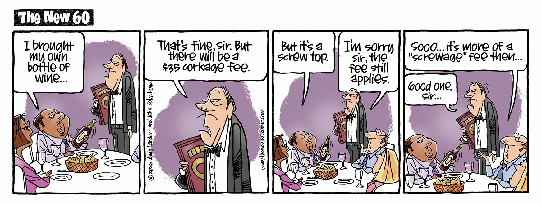
I was curious, though, in the humour category, to see if there was anyone else there focused on retirement humour that went past sex-crazed snowbirds or old-age homes, or men wearing black socks, or false teeth issues. Aunty Acid is one, Maxine is another. Although they do trend at times towards “grumpy old woman” / wine / yoga pants / naps motif. I found The New 60…click through to see the blog and the latest entries, they’re quite good.
Pickles and Flo & Friends are decent, although a bit too snarky for my tastes. I also tripped over Oldster Magazine (already mentioned in a previous post, I think).
And that’s the ballgame for now.
Some good ideas, and some stuff resolved. Not a bad situation.
